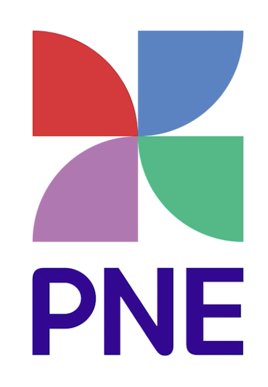
New PNE logo by Cossette (PNE.ca)
Bob Mackin
The PNE calls its new, June 22-unveiled logo an evolution of the familiar pinwheel symbol.
The non-profit board behind the annual summer and Christmastime fairs at Hastings Park is no longer calling it the Pacific National Exhibition. They say the PNE is not national but it is more than an exhibition.
The shape of the new red, blue, green and purple logo is more international, however, because it is already exhibited by companies on at least two other continents.
An online search found the same design, with different colours, was used to promote last November’s Energy Cultural Festival in Irkutsk, Russia. Likewise for a digital ad agency based in Brazil, called Top Creative.
The icon may have originated on the MacZ.com stock graphics and photos website, where it appears under the heading “coloured spin gradient element.”
“Although we entertain over three million guests to our site annually, we focus our marketing in B.C. and Canada, and so there was never an intention to register the logo outside of Canada, so I can’t comment on similar logos from other countries,” said PNE spokesperson Laura Ballance.
She said the PNE paid national marketing and communications agency Cossette $17,500 and the organization is in the final stages of registering the new logo.
“They reviewed similar logos across Canada and in our sector specifically throughout North America, and didn’t find a conflict,” Ballance said. “To be transparent though, since this is a refresh of an iconic logo that goes back to our very inception, we likely would have proceeded even if something was close, as many in B.C. would first attribute the pinwheel to the PNE.”
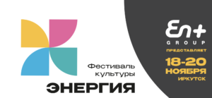
Russian Energy Festival in Irkutsk (En+)
Ballance explained the PNE is promoting itself as a year-round entertainment destination where play happens every day.
Lindsay Meredith, professor emeritus of marketing at Simon Fraser University, said the PNE doesn’t have deep pockets to invest in branding like Apple or Nike. He said second-tier companies with smaller budgets have to be careful how much they borrow and how accurately they borrow the look of another. Otherwise, they could be accused of violating trademark law.
“I wouldn’t be surprised if these guys have got access to other forms or have simply gone on the web and pirated other other formats that look easy to copy, changed the colour and away we go,” Meredith said.
Meredith said the new PNE logo would be just as effective on the corner of a smartphone screen as it would in giant form on the side of a building at the PNE or a billboard around the city. It conveys a fresher message about the 113-year-old organization, which boasts something to entertain every member of the family.

Brazil digital ad agency Top Creative
“They’ve got a feel for the importance of marketing and what’s going on there and how they have to go about it and, what they had to do in terms of creating brand choice under that one umbrella,” Meredith said.
The PNE and its previous logo were both registered in December 1990 by agent Gowling WLG (Canada) LLP in Toronto. The trademarks, which expire in 2030, cover a list of categories, including souvenir items, exhibitions, fairs, sporting events, restaurants and concessions.
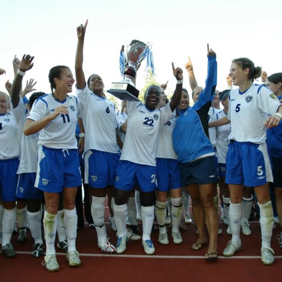
The 2023 PNE Fair runs Aug. 19 to Sept. 4, with events around the site year-round.
Support theBreaker.news for as low as $2 a month on Patreon. Find out how. Click here.